Rob pulled out his business card and handed it to Sandy. It was harder to read than Sanskrit.
All too often, you get someone’s business card and confusion sets in. The information is endless, chaotic like a rapid waterfall. You don’t know where to begin. Or worse still, you’re not sure what they offer & the card is forever lost in marketing oblivion. If this has never been you, then kudos! But if you’re just getting started, or realize it’s time to rebrand, we’re here to help. Below are four ways to catchier business cards.
How are we so sure these methods work? Research aside, we’ve even left business cards in restaurants and gotten calls!
Keep it Simple
Cards are here to wow, pass along information & make us look professional. Professional doesn’t mean a black hole for fun & excitement. We can keep it interesting without laying it on too thick. One of the most common errors we see in business cards, is that there is too many graphic effects. There’s an overwhelming background, glowing text, photos that don’t make sense, long lists/copy, chaotic layouts that are hard to follow & the list goes on.
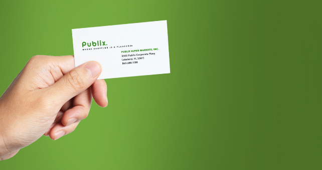
Take a look at the card below. Publix, one of the US’s largest grocery chains at $30.56 billion revenue, has one of the most simple cards. But smaller companies like ours, who aren’t raking in billions yet, may want to use our business cards as an opportunity to sell ourselves. We talk more about that below.

Place Your Message Here
By keeping things simple, you’ll be left with room for some advertising. And we would not suggest creating another set of business cards without social media information. Firstly, because social media is digital, it can be updated constantly whereas your business cards can only be updated at the time of printing. Secondly, because you want to get your prospects lost in your brand & social media is great place to start. We’ll explain.
Have you ever kept a potential vendor’s, or competitor’s, webpage open all day because you thought it was the neatest thing? Maybe you went to their blog or social media, read reviews, watched online videos & clicked through scores of photos much like you would your favorite musician or celebrity? This is what we mean by getting lost in a brand.
We also suggest, if you have one, using your tagline. It doesn’t have to be complex, and it doesn’t have to be permanent. Coca-Cola has made scores of changes to their tagline since their inception. And if you don’t have a tagline, we can help!
You could also use the card’s second side as an opportunity to list a few products & services, show off a product photo, a short mission statement or sales pitch.
Make Sure it Matches
Like a pair of shoes, each of your marketing cogs should match the other. As your marketing effort grows, and you cross more platforms, this is becomes more difficult. But when your brand’s footprint is smaller — a website, stationary, a print advertisement or two, signage — this is easier. Colors, logo & logo placement, advertisement layouts & typography, signage, fleet cars, apparel, fonts; all of these sorts of things should look similar.
But why does this matter? Why does everything need to match? Unless you’re the second coming of Bill Gates, it’s easy for a brand to get lost in the fray. In a study quoted by the New York Times, one person can be exposed to 3,000 to 20,000 marketing messages in one day. In order for our brands to standout, and since marketing is segmented across many channels, we have to make our brands easily recognizable across them all as to embed them into our prospect’s minds.
So now Rob now whips his business card out with full confidence, not a shaky bone in his body. His recipient’s no longer toil, long hours, trying to decipher the card or laugh about how terrible it looks. It’s now clean & concise but, with a call to action. And makes him like a Fortune 500 CEO, and that’s strong brand positioning. And if you aren’t yet, you too can be like Rob. Give us a call to discuss what changes you’d like to see in your brand. We love helping!
